
The first (lower) sample used two reds that were too close in both hue and value. In the photo below, the yarns used in the sample are on the left, and the yarns I propose to use in the final piece are on the right.

As you can see, in the trio on the left the two reds are too much alike, and there's too much contrast between the two of them and the bright gold. In the trio on the right, there is value difference between all three yarns, as well as much more obvious hue differences. I think they will be much better choices.
The yarns in the second (upper) sample made me happy so I've begun weaving that piece. The original design file looks like this:

The light aqua blue is a border woven with equal parts of color A and color C (reading from left group to right group. The dark strip with the color chips was cropped off the file after applying weaves but before taking the file to the loom to begin weaving. Instead of the white yarn I first intended for color C, I found a light lavender and subbed it in for color C. Colors A and C are similar in hue (blue-violet), but different in value, as you can see from the yarns in the shuttles and the weaving itself:
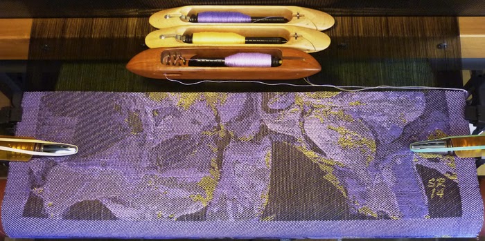
It's a very subdued and subtle piece, which I'm enjoying weaving.
In other news, two skeins of 30/2 silk have finally emerged from a wood-derived dyepot after over a week of soaking. The wood is Jatoba (sometimes called Brasilian cherry although isn't a fruit tree) and the resulting color is similar to what I'd expect from true cherry wood. Apricot? Peaches and cream? I'm not sure what to call this color, but it's lovely!


2 comments:
Elegant. :)
cheers,
Laura
I'm still trying to understand the color use about three/four posts ago. Goodness, I'd better catch up soon.
Post a Comment