
Because the distance between the upper and lower front cloth rollers is greater on the jacquard loom than the 24-shaft loom, I get a good view of the face of the cloth down there. It isn't well lit, and there's the challenge of getting the camera to focus properly, but here's the aspen grove.
After completing the weaving on the grove, I began sampling for the next project, which is an assignment required each year by Designing Weavers. This year's annual project has a theme of "Ancient Paths, New Visions." Just like the Convergence theme - usually, Designing Weavers mounts an exhibit in conjunction with Convergence, so choosing the conference theme is appropriate. This year, unfortunately, HGA was so late in announcing the Convergence location that it was impossible to get a venue lined up for the DW exhibit. But we're going ahead with the theme anyway.
The image I chose to express the theme is a view through a ruined stone archway somewhere in rural England to farmlands in the distance. I took the photo on a trip to the UK and Europe in 1974. Since I'm not quite ready to tackle any of the advanced structures for putting multiple colors in the same weaving, I tried a few short samples using 7 shades of grey and 4 shades of green, using 2 different greens to see which worked. Bummer. Neither of them did what I wanted.

So I thought to myself, "Okay, what would happen if I weave it in black and white, and then paint the picture with thickened dyes?"
My mother, the photographer, grew up in a time when the only camera film available to the typical consumer was black and white. She did her own developing and printing, and often if it was a family portrait, she would then hand-tint the photo to mimic what she envisioned that a color print would look like.
Yesterday, I got the weaving about half done (it goes quickly with only one shuttle!) and should finish it today. Then I'll weave a test strip to practice the dye process on, and cut them off the loom.

The structure is 10-end shaded satin, which gives a lot of detail; the weft is 30/2 silk, a little heavier than the 20/2 cotton warp. Why silk? Because for a variety of reasons, I decided that I'd rather do the dye painting with acid dyes on silk than with fiber reactive dyes on cellulose. The black warp is cotton, but the dyes won't affect it - the black will just give a range of values where an area of shaded satins is painted with a single hue.
That's the theory anyway. I'll post some pictures when the sample is painted.


3 comments:
In awe! The aspens are wonderful. The archway and farmlands in b/w remind me of a pencil sketch--great as is.
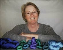
Love the high tech rubber bands holding on the pill bottles.
My mother used to tint photos too. :) Will watch with interest to see how it goes.
Cheers,
Laura
love those experiments
looking forward to seeing this one.
Post a Comment