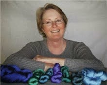
But on the jacquard loom, because the choice of weft color is so critical to the overall appearance of the piece, I've had to change my ways and make samples. For this I use the strip of color chips at the bottom of each of my image files. First I use those chips to make it easier to selectively assign weaves to colors. Then I use the chips as test strips.
Yesterday, I wove the test strip for the Big Sur piece (original image shown here) and thought I had a good selection of colors for the wefts: a turquoise blue, white, and a deep rust for the highlights on the rocks where the morning sun hits just the top edges. The test strip looked okay, so I went ahead and wove the first few inches of the real piece. Ooops.

The deep rust makes all the "black" areas too red/brown. Which I wouldn't mind in the border, but where there are "black" areas in the surf that have a reddish cast, I do mind. So I decided to scrap what I'd woven so far and try a different weft in place of the rust - something that would work as the highlight on the rocks, and still look water-ish in the "black" areas. I tried a bright gold - maybe you can see the difference in this closeup if you click to enlarge:

The bright gold is a little too bright, so I went back to the dyepots, and tried for a duller, darker gold. It's drying as I write, and hopefully it'll play nice in the image.
In the meantime, because I still had most of the afternoon to work, I started weaving the image of the Golden Gate Bridge (image shown here, lower on the page than the Big Sur image):

The wefts are a greyed blue-violet, a bright orange, and a pale grey. In this piece, I don't mind the reddish cast in the "black" areas, because those areas are land, bridge, or buildings - not water!
BTW, I put quotes around the term "black" because in the satin structures on the jacquard, the wefts have to interlace with the warp in 9-end satin order (1/8, 2/7, 3/6, 4/5, 5/4, 6/3, 7/2, or 8/1, according to how bright or dark I want the weft color to look), so they do appear on the surface occasionally. This means there is no true black, because any "black" area has flecks (however tiny) of each of the weft colors showing among the warp threads, as you can see in the closeup.


4 comments:
sampling is a sign of growing up. ask me how i know ;)
Very interesting to compare the two yarns in your close-up. I'm looking forward to seeing how the new shade of gold turns out!
Such an interesting process, maybe the most enjoyable part of the work. Just curious—these look more like twill than satin. Is it just an illusion?
I think it depends on the size of the satin (7, 8, 9, 10, whatever) and the counter you use to determine the layout of the black pixels in the grid. Some combinations seem to accentuate the diagonal more than others.
Post a Comment